Procedure
HTML Structure:
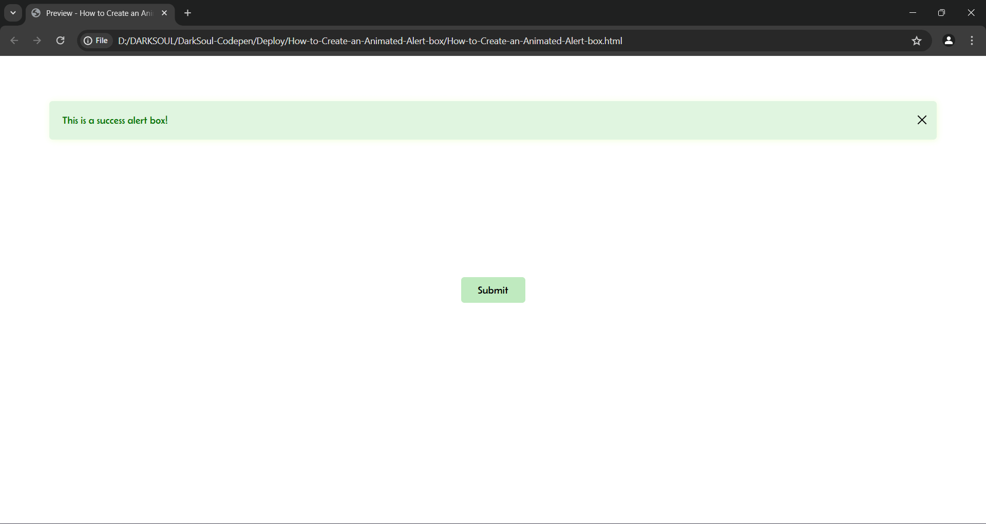
- The HTML code includes a div element with the id 'jsalert'. This div represents the alert box and is initially hidden.
- Inside the div, there's a message "This is a success alert box!" and a button to close the alert.
- A separate button outside the div is labeled "Submit", which will trigger the alert box to appear.
CSS Styling:
- Font and Layout: The body uses custom fonts from Google Fonts, and flexbox layout to center content.
- Alert Box Styles: The .darksoul-alert-js class hides the alert box by setting its width and height to 0 and display to none.
- Show Alert Styles: The .show-alert class defines the visible state of the alert box with dimensions, border-radius, box-shadow, and animation properties.
- Button Styles: The close button (.alert-close-btn) and the submit button (.darksoul-btn) have hover effects for better user interaction.
- Animation: The @keyframes animate rule defines the sliding down effect for the alert box.
JavaScript Functionality:
- The script selects the alert box div using getElementById.
- The alertbox function toggles the show-alert class on the alert box. This makes the alert box slide down into view or hide when toggled again.
- The close button call this alertbox function when clicked.
User Interaction:
- Clicking the submit button makes the alert box appear with a sliding animation.
- Clicking the close button hides the alert box.
Feel free to test and tweak this code to fit your project needs!