Procedure
Step 1 - Basic Button Setup: Start with a simple button element. Set the width and height to your preferred size (e.g., 200px by 50px). Use border-radius for slightly rounded corners and add a border that complements your color scheme. Ensure the button's text is centered using flexbox properties.
Step 2 - Adding the Color Fill Element: Inside the button, include a hidden element for the color fill effect. Initially, set its visibility to hidden, and style it with a small width (e.g., 2px) that matches the button's height. This element will expand on hover.
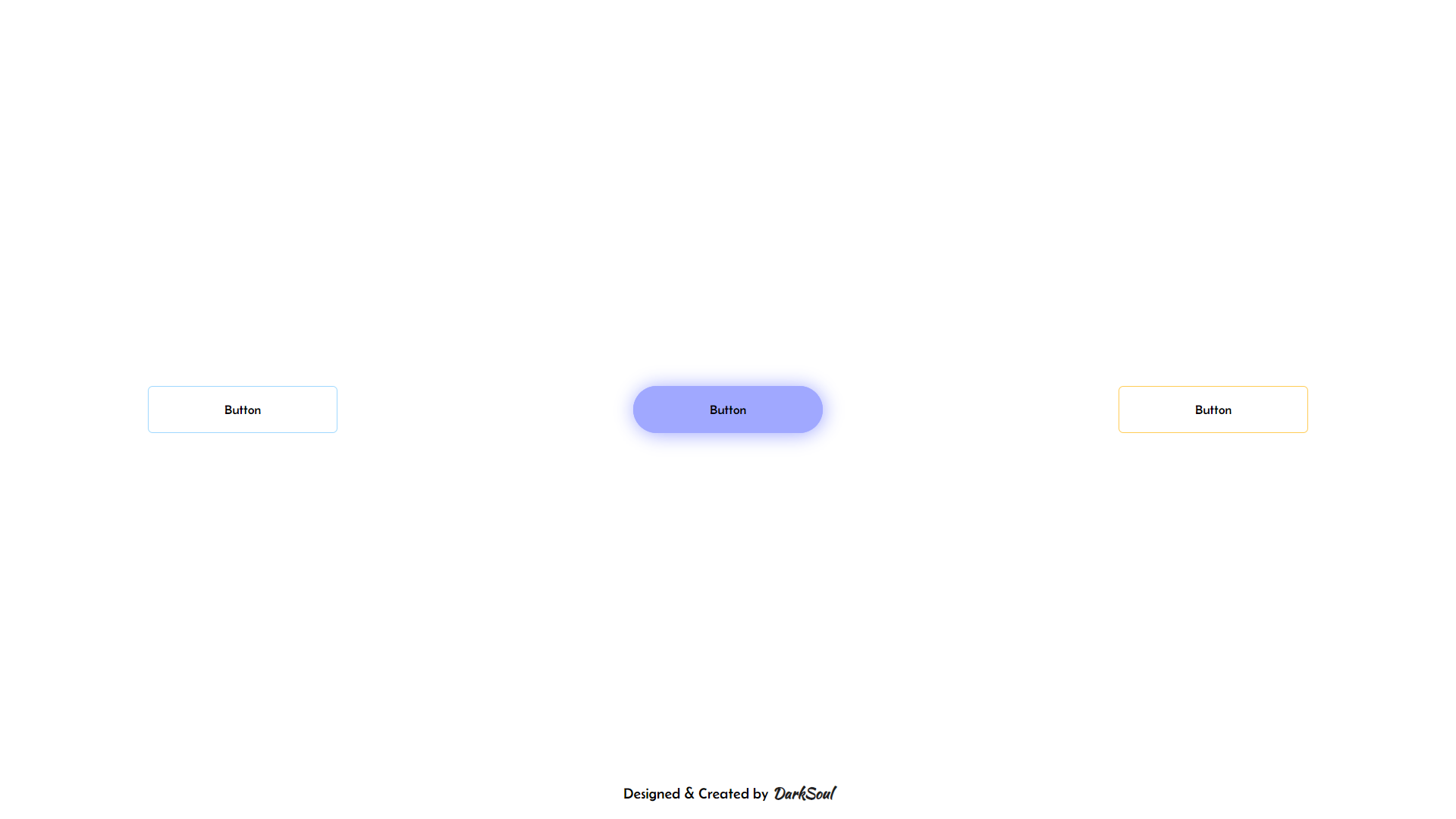
Step 3 - Hover Effect: Apply the hover effect to the button. On hover, the color fill element's visibility changes to visible, and its width expands to cover the entire button. Use a transition property with a cubic-bezier timing function for a smooth expansion. Also, add a box-shadow to the button for a glowing effect.
Step 4 - Ensuring Text Visibility: To keep the button text visible over the color fill, set the text element's z-index higher than the fill element. This ensures the text stays on top during the hover effect.
Step 5 - Final Touches: Test the button to ensure the hover effect works seamlessly. Tweak the transition speed, colors, or shadow intensity as needed to achieve the desired look. This final step helps refine the button's design and interaction.
By following these steps, you can create a sleek and interactive Hover Fill Button that enhances user engagement. It's a simple yet effective way to add dynamic elements to your web designs. Keep experimenting and refining your designs to make them truly stand out. Happy designing!
