Procedure
Step 1 - Basic Setup: We start by declaring the document type (DOCTYPE html) and setting the language to English (html lang="en"). The head section includes the character set, viewport settings, and the title of the page ("Preview - Hover Fill Card").
Step 2 - Importing Fonts: The code imports three Google Fonts: 'Belanosima', 'Rubik Vinyl', and 'Grand Hotel'. These fonts are used in different parts of the page to give a unique look.
Step 3 - Body Styling: The body is styled to take up the full width and height of the screen. The display is set to flex, which helps in centering the content. The default font for the body is 'Belanosima'.
Step 4 - Link Styling: Links (a) are styled to have no text decoration, and the content within them is centered using margin: auto.
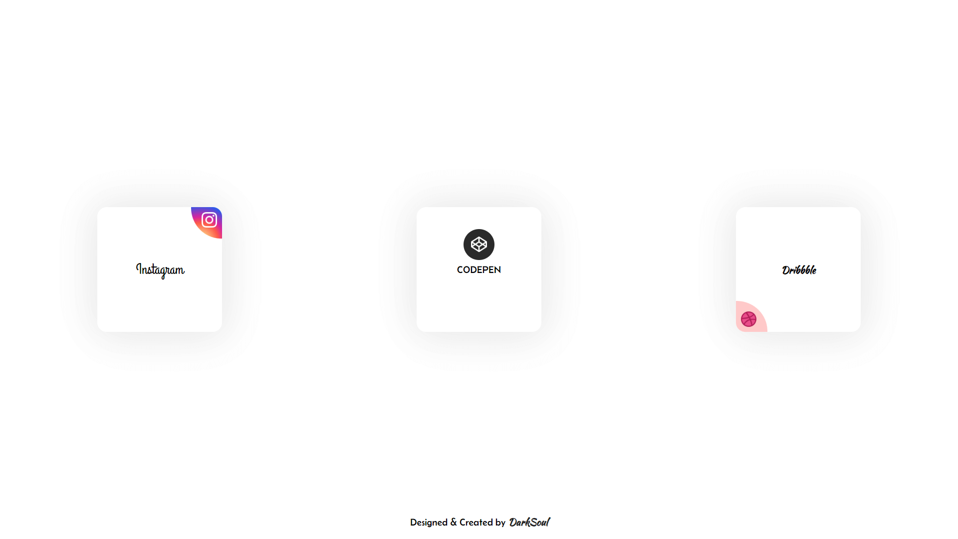
Step 5 - Card Styling: Each card has a unique class (darksoul-card1, darksoul-card2, darksoul-card3) but shares some common properties:
- Size & Shape: All cards are 200px by 200px, have rounded corners (border-radius: 15px), and a white background.
- Box Shadow: Each card has a soft shadow to give it a slightly lifted appearance.
- Alignment: Inside each card, content is aligned using align-items and justify-content with different settings for each card.
Step 6 - Circle Elements: Each card contains a "circle" element, which is a div with a unique class (circle1, circle2, circle3).
- Position & Size: Initially, these circles are positioned and sized differently. For example, circle1 has a specific gradient background, while circle2 and circle3 have solid colors.
- Hover Effects: When you hover over the cards, these circles expand to fill the card and change shape, creating a cool animation effect. The text color also changes to white.
Step 7 - Content Inside Cards: Each card contains an image and a text element (h2, p, h4) that describe what the card represents (Instagram, CodePen, Dribbble). The z-index is used to ensure the text and images appear above the expanding circles.
Step 8 - Media Query: There's a media query for screens smaller than 600px, which adjusts the layout so that the cards stack vertically instead of horizontally.
By following these steps, you can create a visually captivating and interactive card layout that not only highlights your creative skills but also enhances user engagement. Keep experimenting with different styles and animations to make your web designs even more unique and appealing. Remember, the key to great design lies in the details and your willingness to explore new ideas. Happy coding!
