Procedure
Step 1: HTML Structure
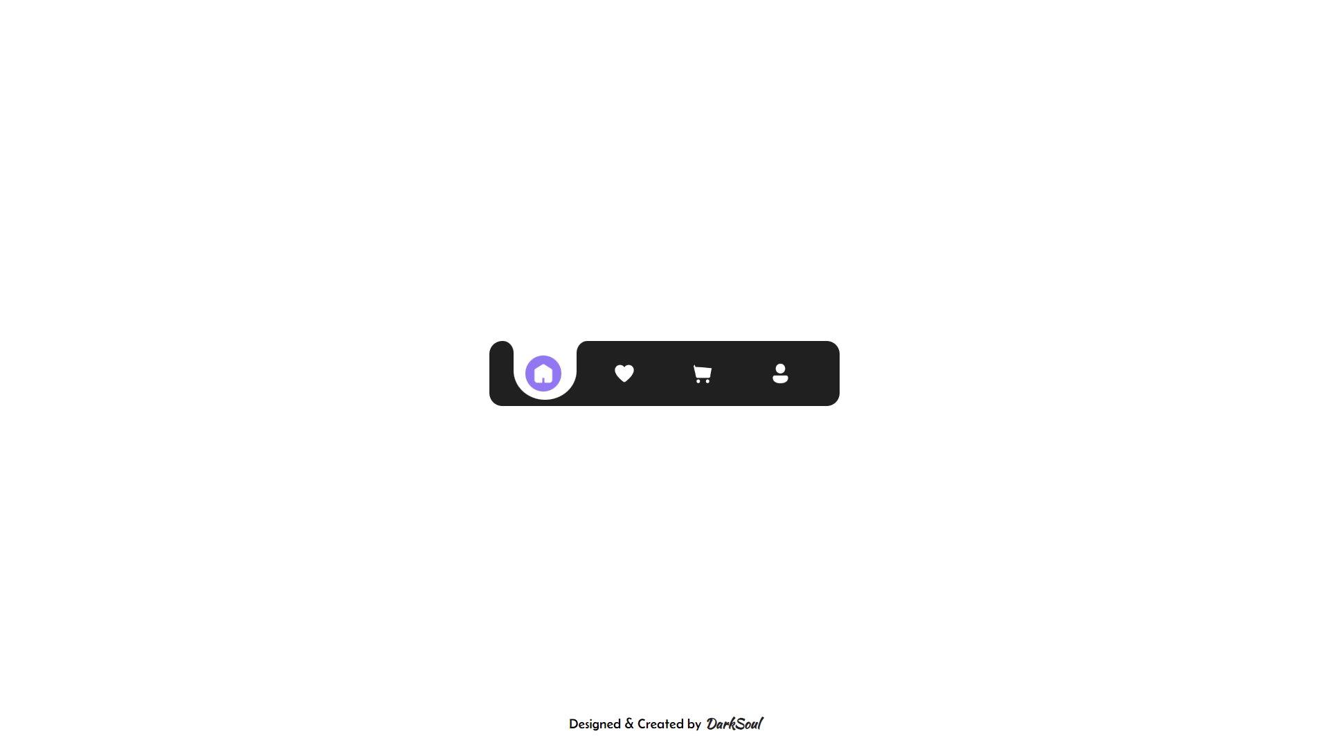
The basic layout is built using HTML. The <div> with the class darksoul-fluid-tab-bar holds everything together, giving it a nice container. Inside this, there's another <div> with the class menus, which contains all the menu items, including icons for Home, Like, Cart, and Profile.
Step 2: Importing Google Fonts
The first thing in the <style> tag is importing fonts from Google Fonts: Belanosima for modern text and Kaushan Script for a cursive look. These fonts will give a unique feel to any text you add in the design.
Step 3: Styling the Body
The body takes up the whole viewport with 100vh, and everything is centered using flexbox. This ensures that the Fluid Tab Bar is displayed perfectly in the middle of the screen.
Step 4: Fluid Tab Bar Container Styling
The .darksoul-fluid-tab-bar class styles the tab bar: It’s 270px wide, 50px tall, and has rounded corners (border-radius). The background color is a dark grey, and it’s zoomed 1.5x for a better view.
Step 5: Menu Items
Inside the tab bar, each .menu-item (like the Home, Like, Cart, and Profile) is designed with a specific layout: Each .menu-item has a unique background that resembles fluid, rounded tabs. The rounded corners are created using border-radius, and they change dynamically when selected.
Step 6: Fluid Animations
The tabs move smoothly when clicked, thanks to animations. There are several @keyframes defined to control the animations, such as move-f-2, move-s-1, etc. These animations define how the tab moves when switching between menu items.
Step 7: Circle & Square Design
The .l-square and .r-square classes style the small white squares on either side of the tab. Inside these squares, the .l-circle and .r-circle create black half-circles, giving it a nice rounded feel.
Step 8: Icons
The tab bar uses icons for each menu item: Home, Like, Cart, and Profile. These icons are imported from Icons8, each styled with a cursor: pointer to make them clickable.
Step 9: Hover Effect
The hover effect for each icon is styled so that when you hover over them, the background color changes to a soft purple shade.
Step 10: JavaScript Logic
The movement of the tabs is controlled using JavaScript. The move(goto) function is triggered when an icon is clicked. It checks the current position (curpos) and moves the selected tab accordingly. For example, if you're on Home and click on Like, it moves the tab to the second position.
By following these steps, you’ll create a sleek, modern, and fluid tab bar that enhances the user experience. Experiment with different colors, icon styles, and animations to make your design unique!
