Procedure
Step 1: HTML Structure
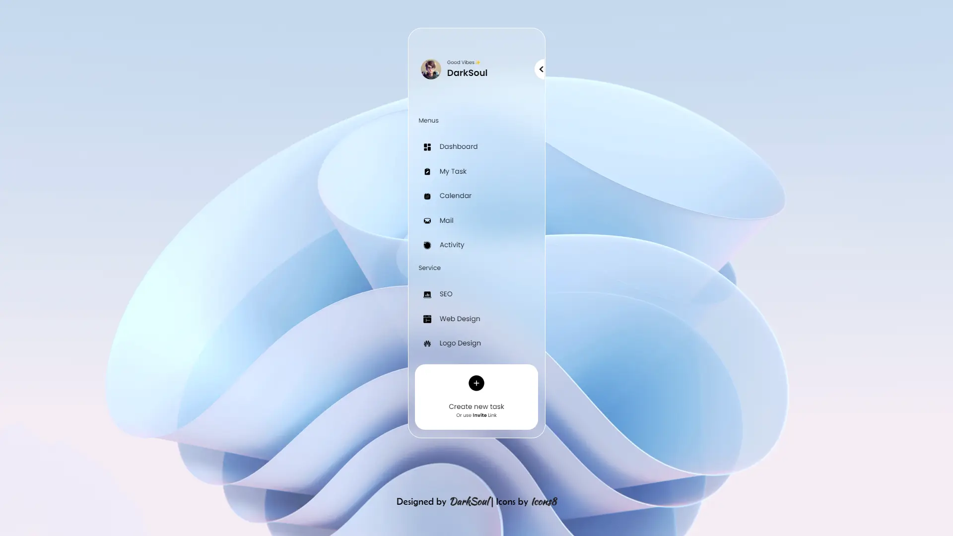
Start by setting up the basic HTML structure. A <div> with the class darksoul-blurred-sidebar will be the main container for the navigation bar. Inside this container, create an unordered list <ul> with multiple <li> elements, each representing a different navigation item (like Home, Services, About, Contact, etc.). Each <li> should contain an icon and a label for better navigation visibility.
Step 2: Importing Google Fonts
In the <style> tag, import fonts from Google Fonts. Use Montserrat for a clean and professional look and Poppins for a more modern feel. These fonts will make the navigation labels appear more visually appealing.
Step 3: Styling the Body
Apply basic styles to the body, such as setting 100vh to ensure the sidebar takes up the entire viewport height. Use flexbox to center the content if needed, and set a dark background color for the rest of the page to make the sidebar stand out.
Step 4: Blurred Sidebar Styling
The .darksoul-blurred-sidebar class will define the sidebar's look. Set the width to around 250px and the height to 100vh. Use backdrop-filter: blur(10px) to create the blurred effect. Set the background color to a semi-transparent dark shade (rgba(0, 0, 0, 0.5)) for a frosted glass appearance. Add some padding to create space inside the sidebar.
Step 5: Navigation Items Styling
Style each <li> element to make it visually appealing. Use padding and margin to space out the items. Add a hover effect that changes the background color slightly when a user hovers over a navigation item. Set the font-size for the labels to make them readable and ensure the icons are aligned properly with the text.
Step 6: Icon Styling
Icons can be sourced from Font Awesome or Icons8. Set the icon color to white or a light shade to make them stand out against the dark blurred background. Use font-size adjustments to match the size of the labels.
Step 7: Active State Styling
Add styles for the active state of a navigation item. This can include a bolder font weight, a different background color, or a small border to indicate the current page. This provides visual feedback to users, letting them know which section they are in.
Step 8: Mobile Responsiveness
For smaller screens, adjust the sidebar's width or switch to an off-canvas approach where the sidebar is hidden and can be toggled with a menu button. Ensure the text size remains readable, and icons are appropriately sized.
Step 9: JavaScript for Toggling
Use JavaScript to toggle the sidebar's visibility on smaller screens. Create a toggleSidebar() function that adds or removes a class that controls the sidebar's open/close state. Attach this function to a button or icon for users to open the sidebar when needed.
Following these steps will help you create a visually appealing and functional blurred side navigation bar. Customize it further with different colors, fonts, and effects to make it unique to your project!
